Customize the sign-in UI
Docs version v1 (main)Nauthera is pre-1.0, in a design-partner programUpdated
Every screen Nauthera shows your users, from sign-in and sign-up to passkeys, the second factor, consent and errors, is built on the Astryx design system. A brand is a theme in that design system's own terms, written down as data. You can change a single accent color, or every token, font, radius, animation speed and component style.
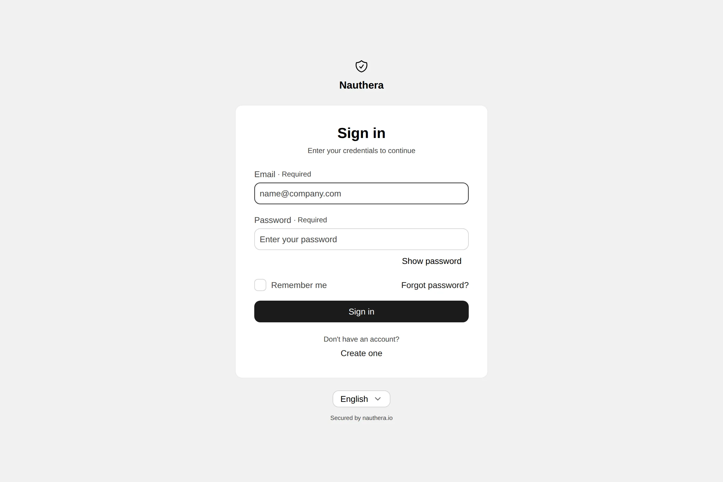
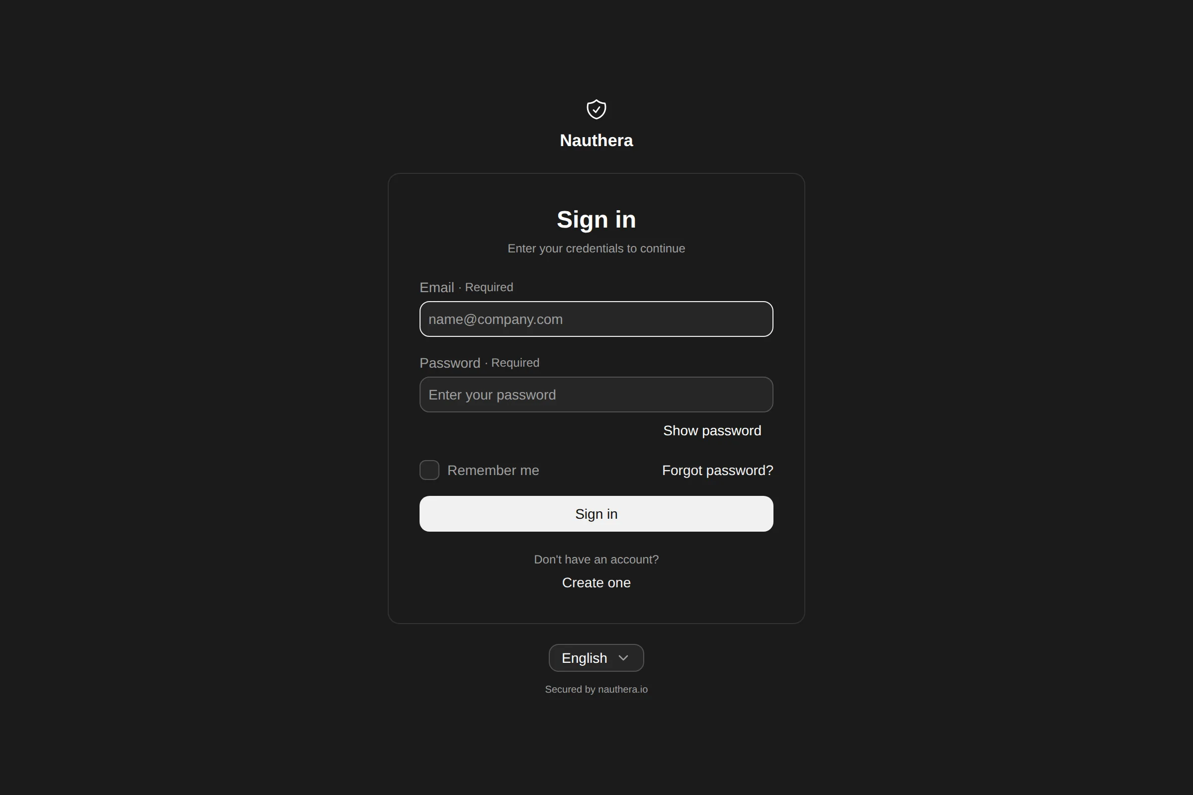
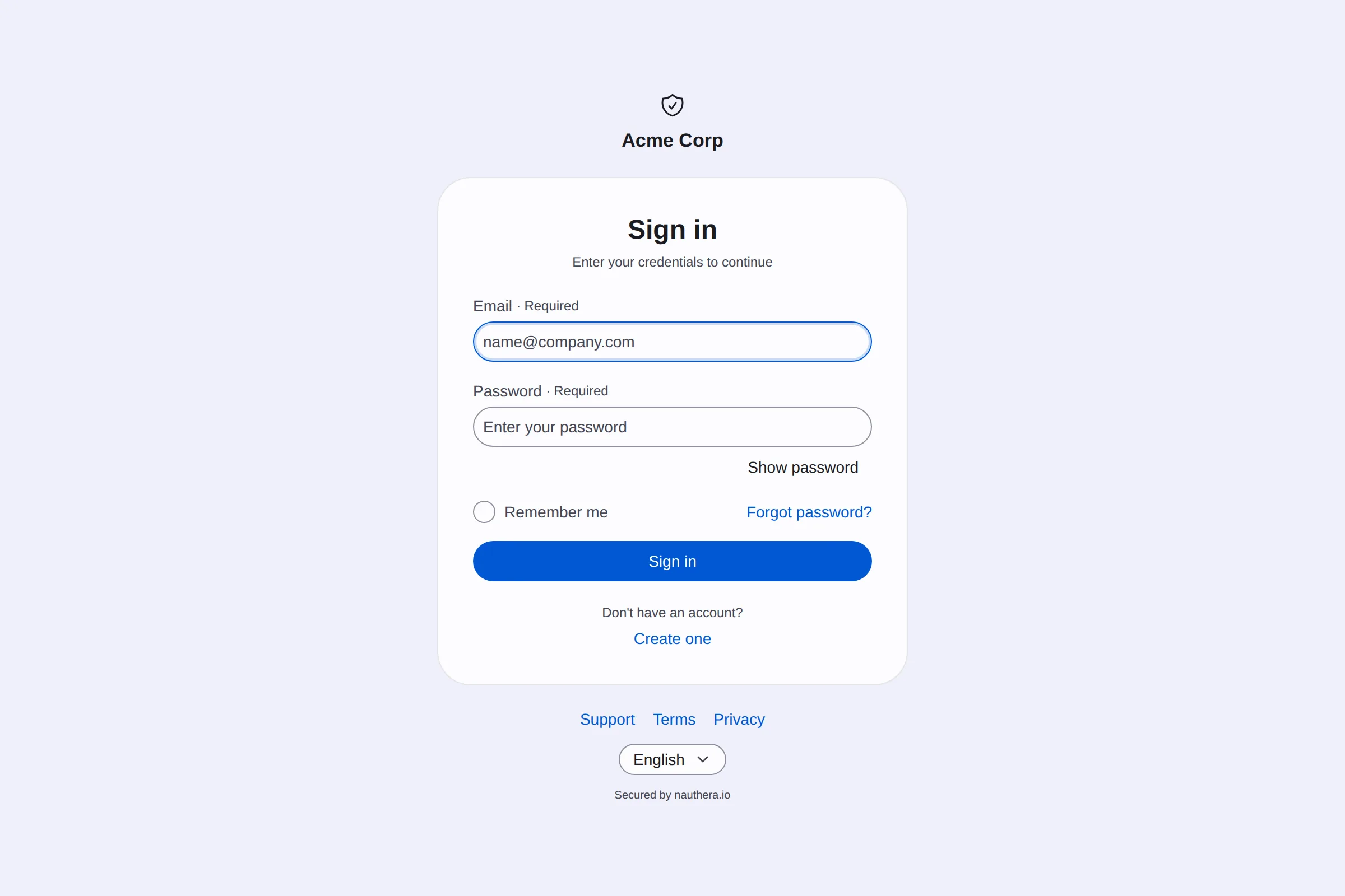
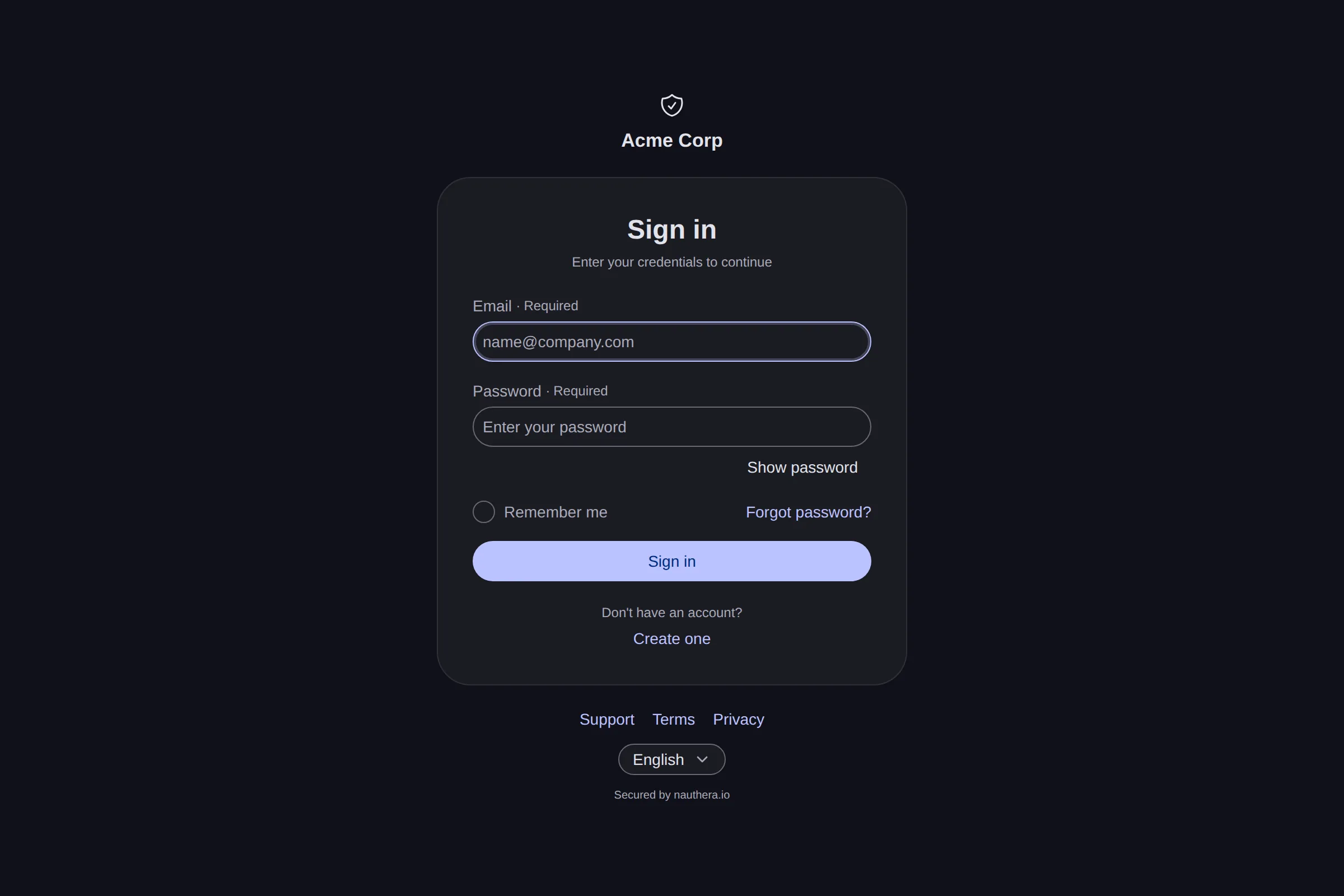
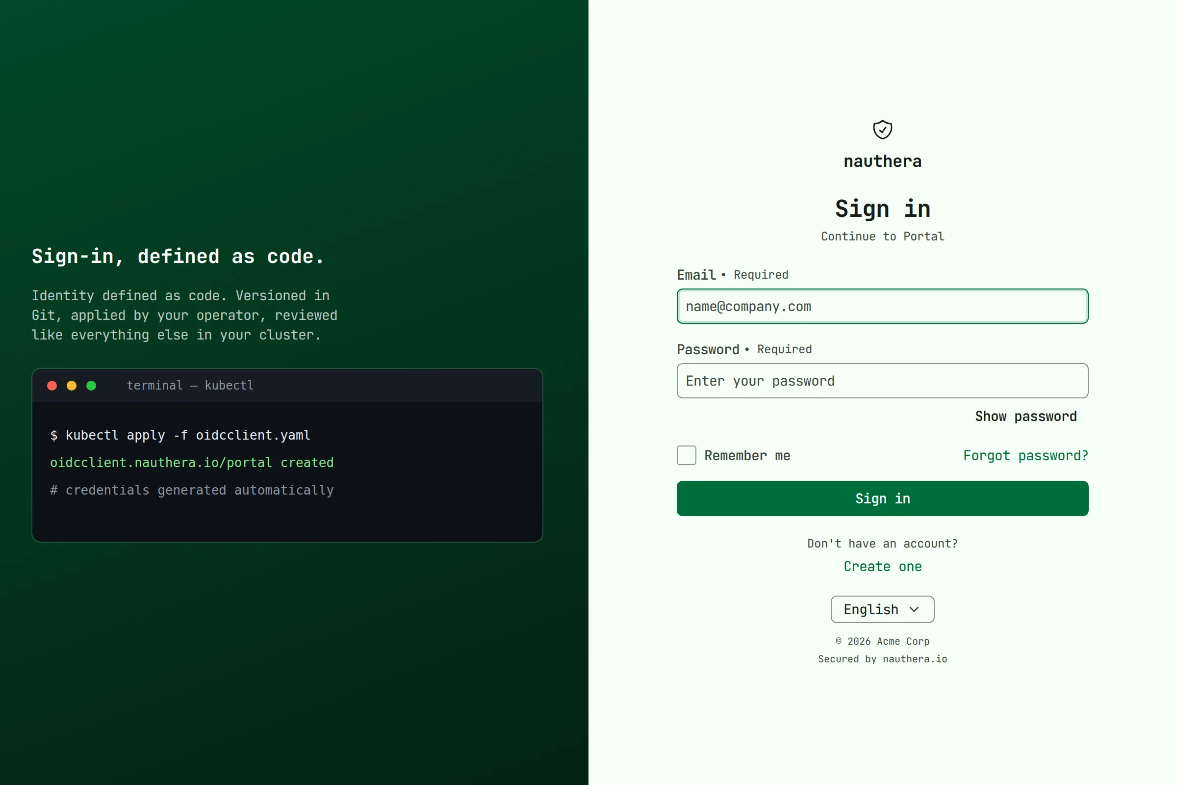
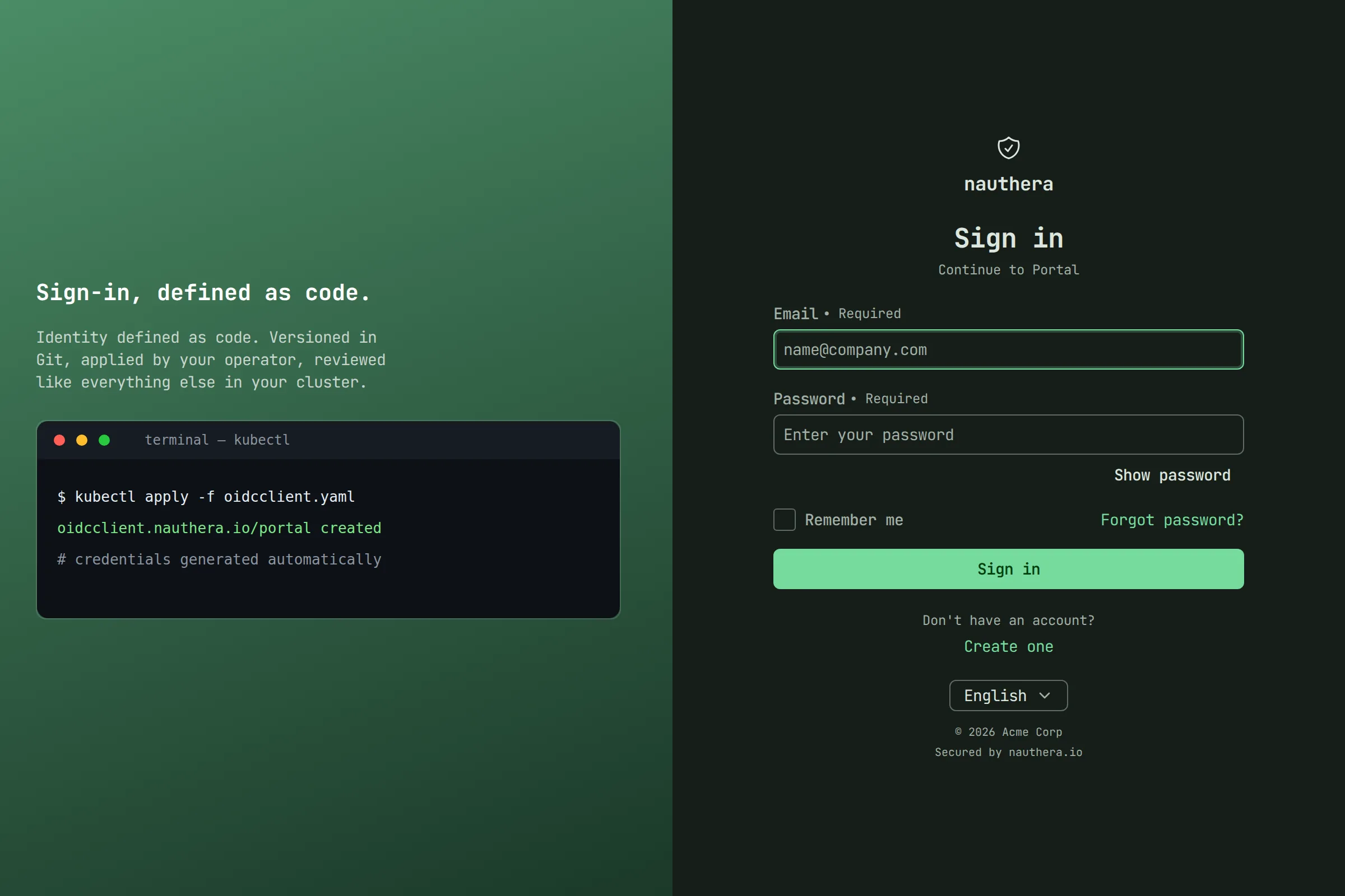
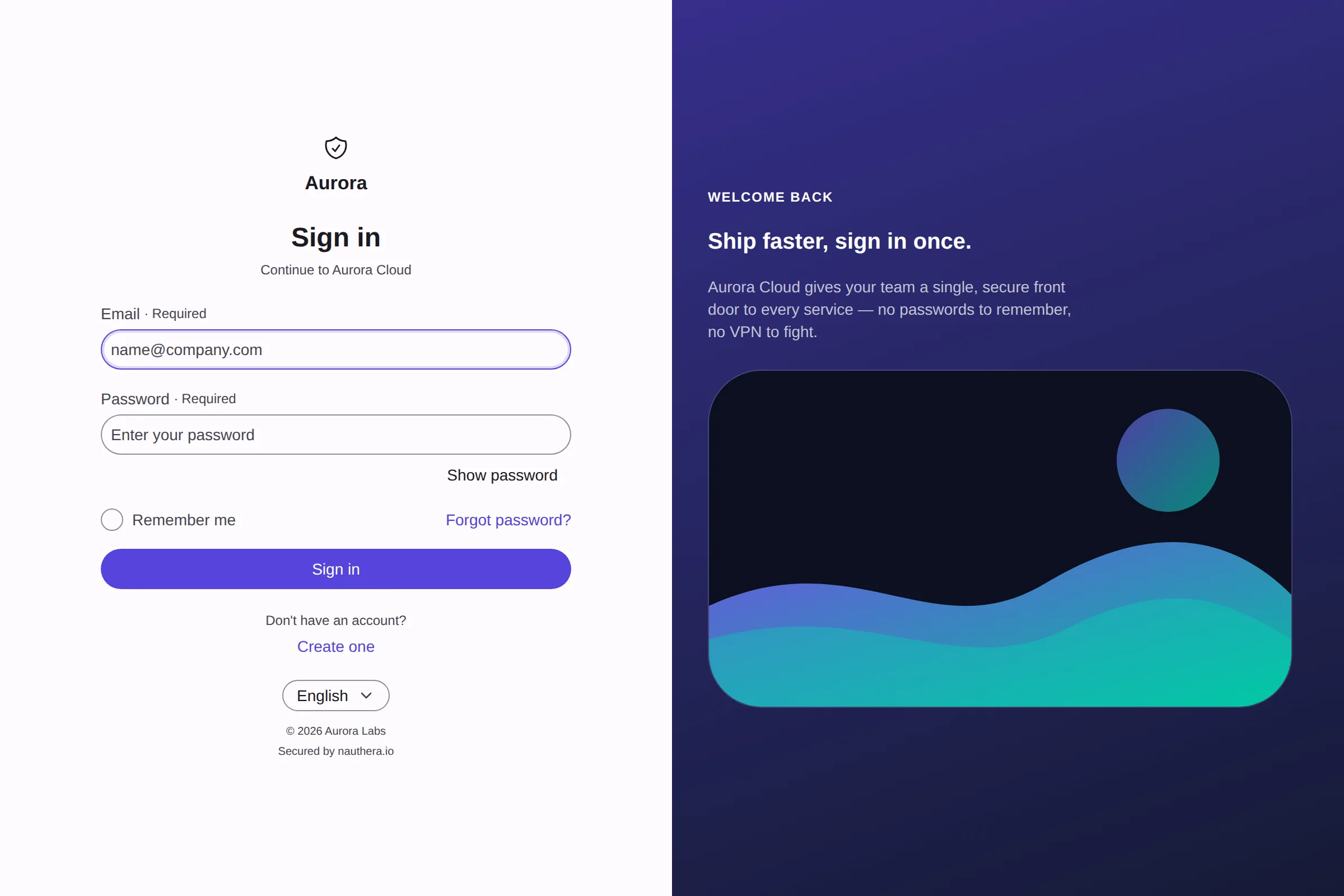
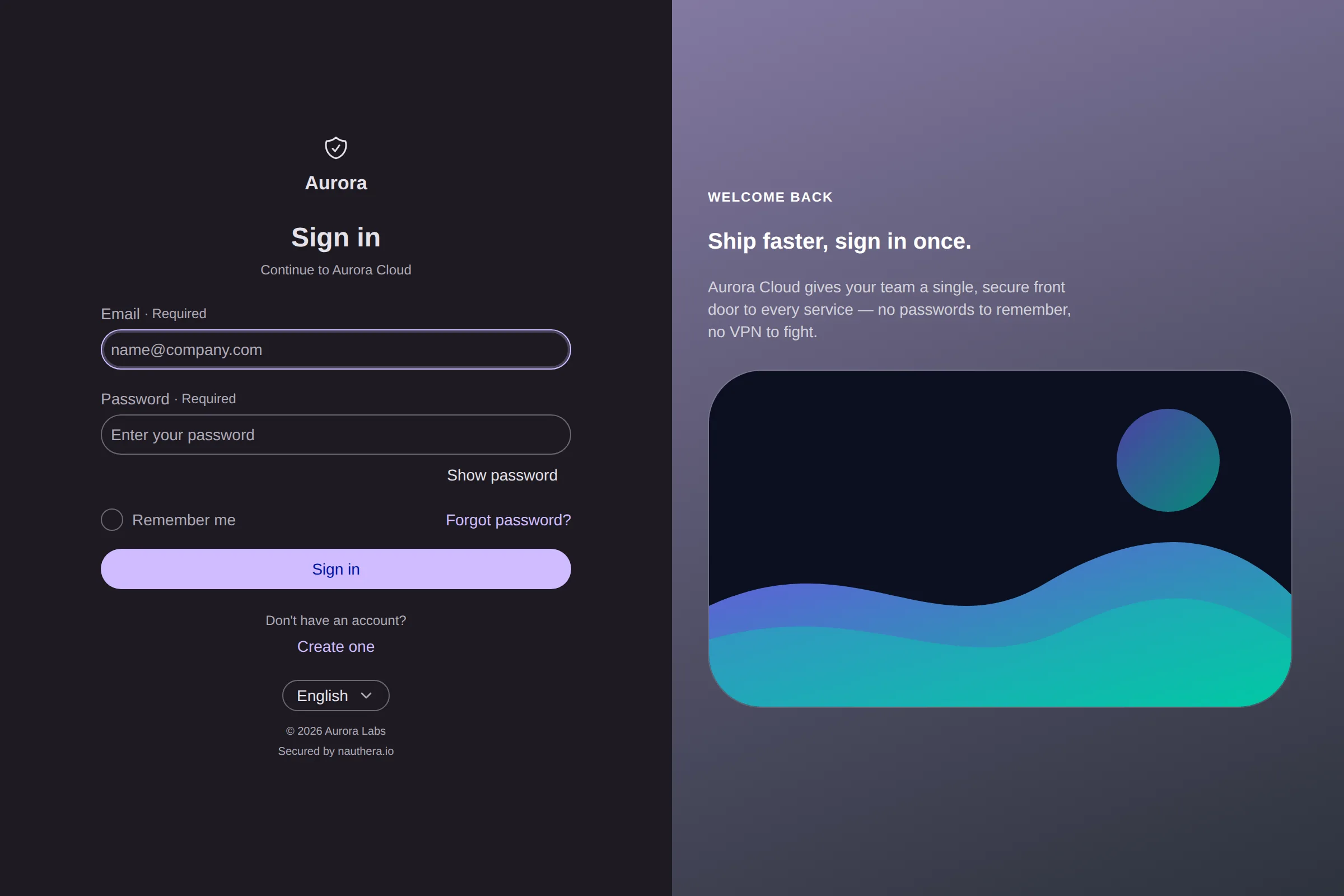
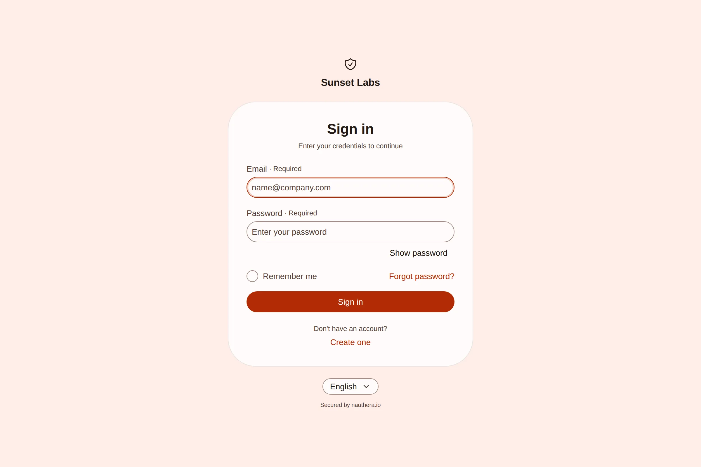
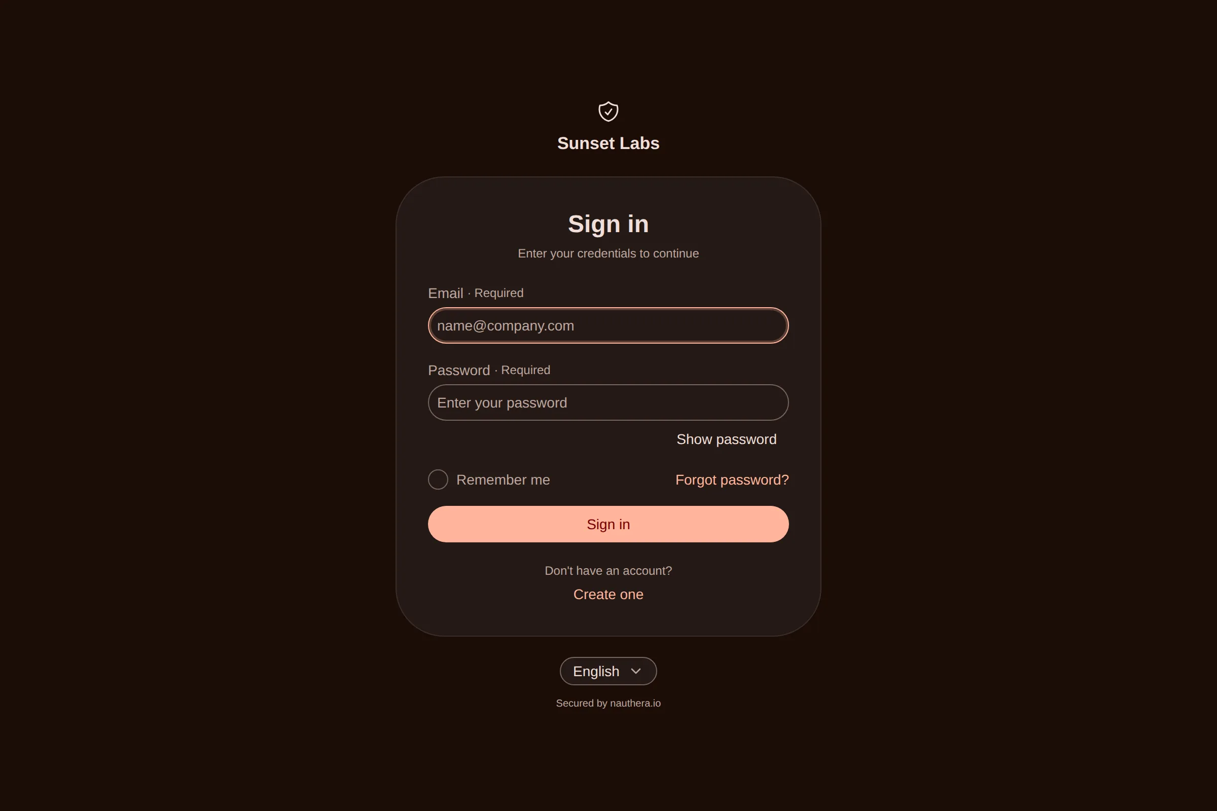
The tabs above show one sign-in screen in five of the example brandings nauthera-server ships. Each is one short document, and the gallery on the Branding resource page shows each one as a manifest.
This guide brands one OAuth client's pages with a
Branding resource. An organization-wide default uses the
same document as spec.branding on an Organization,
so every step applies to that too.
Before you start
- The operator is running, and an organization admits your
namespace: for the main organization, the chart's
operator.lists it; for another, thatmainOrganizationNamespaces Organization'sspec.namespacesdoes (which organization a resource configures). The Helm chart's default entry lets the operator's identity write brandings in the main organization. - You know the
client_idof the client to brand, for exampleacme-web. The client does not have to exist yet.
1. Start with the chrome
Some fields need no theme at all. They set what the pages say and link to:
apiVersion: nauthera.io/v1alpha1
kind: Branding
metadata:
  name: acme-web-branding
  namespace: nauthera
spec:
  clientId: acme-web
  branding:
    productName: Acme
    appName: Acme Portal          # "Continue to Acme Portal"
    companyName: Acme Corp        # the footer's copyright holder
    logoUrl: https://acme.example/logo.svg
    faviconUrl: https://acme.example/favicon.svg
    mode: system                  # or light, or dark
    supportUrl: https://acme.example/support
    termsUrl: https://acme.example/terms
    privacyUrl: https://acme.example/privacy
logoUrl and faviconUrl may also be inline data:image/ URIs. The server then serves
them from the sign-in origin, so they don't make every page heavier. The
field reference lists every field and its rules.
2. Design the theme in the Astryx playground
Open the Astryx playground. It renders real Astryx components, which are the components the sign-in pages are built from, so what you see there is what your users will see.
- Open the theme editor. Click the palette icon in the left rail. The editor has three tabs: Base Styles, Components and Advanced.
- Set the colors. Under Base Styles → Colors, set Color Accent to your brand color. It drives buttons, links, focus rings and selected states. Then adjust Color Neutral (the tint of greys and borders), Color Card, Color Surface, Color Body (the page background), Color Muted and Color Text Primary if your brand needs them.
- Check dark mode. Click the moon icon above the preview. Every color you set has a light value and a dark value, and the playground shows the dark ones. Fix any dark color that reads poorly there.
- Set the shape and type. Choose a Preset (Compact, Default, Comfortable or Gigantic), a Heading Font and Body Font, the Type Scale and Type Size, the Corner Radius, Spacing, Element Size and the animation Duration.
- Check it on a phone. Switch the preview to the phone frame. Under 900px the split layout hides its hero, and the form has the screen to itself.
- Restyle components (optional). The Components tab overrides single components, for example the primary button's weight or a card's padding.
- Export. Click Export at the top right. Under Export Theme File, enter a
name and click the download button. The playground downloads
<name>-theme.ts, a TypeScript module that callsdefineTheme({ name, tokens, components }). Share Playground gives you a URL that reopens the same theme, which is handy for a design review.
The playground writes the theme as code, but a branding document holds it as data. Both use the same field names (Nauthera's
themeis thedefineThemeinput), so the conversion in the next step only removes what can't be data.
3. Turn the export into a Branding resource
Click Upload export below and pick the <name>-theme.ts file the playground
downloaded, or drop the file on the box, or paste its contents. The converter runs in
your browser and sends nothing anywhere. It reads the file as data, without running it,
and writes the Branding resource. Fill in your client ID, then copy the manifest or
click Download to save it as a file:
Upload the file, drop it on the box, or paste its contents. It is read in your browser; nothing is uploaded anywhere.
- Left out name: the server sets it when it serves the theme.
apiVersion: nauthera.io/v1alpha1
kind: Branding
metadata:
  name: acme-web-branding
  namespace: nauthera
spec:
  clientId: acme-web
  branding:
    productName: Acme
    mode: system
    theme:
      tokens:
        "--color-accent": ["#0064e0", "#6d9cfe"]
        "--color-background-body": ["#f4f6fb", "#10131a"]
        "--radius-element": "0.625rem"
        "--font-family-body": Inter, -apple-system, sans-serif
      components:
        button:
          "variant:primary":
            fontWeight: 600
Here is what it changes, and why:
| In the export | In the resource | Why |
|---|---|---|
name: 'acme' | left out | The server names a served theme by a hash of its content, so a changed theme is always applied fresh and two organizations never share one. |
'light-dark(#0064e0, #6d9cfe)' | ["#0064e0", "#6d9cfe"] | The same light and dark pair, in the form the docs and kubectl explain use. Either form is accepted. |
--_astryx-… tokens | left out | The playground's internal values. The design system derives them itself. |
| a token outside the design system's vocabulary | moved to localTokens | tokens takes only the design system's own names, and the server refuses others. A newer playground can know tokens the server's design-system build doesn't. |
a value with url(…), @, ;, { or } | left out | The sign-in pages never load a resource from a theme or let a value break out of its CSS rule. The server refuses such a value. |
Fonts need a stylesheet. If your theme names a font such as Figtree or Inter, add
its Google Fonts stylesheet under fonts, or browsers fall back to the next font in the
stack:
    fonts:
      - https://fonts.googleapis.com/css2?family=Figtree:wght@400;500;600;700&display=swap
The sign-in pages load font stylesheets only from Google Fonts.
A smaller theme, by hand
You don't need the whole export. The design system derives a complete theme from a few settings, and for many brands those are enough:
    theme:
      color:
        accent: "#0064E0"        # one color, or [light, dark]
        neutralStyle: cool       # warm, cool or neutral
        contrast: standard       # or high
      radius:
        base: 10                 # 0–64
        multiplier: 1            # 0–2
      typography:
        scale: { base: 14, ratio: 1.2 }
        body: { family: Inter, fallbacks: "-apple-system, sans-serif" }
      motion: { fast: 175, medium: 410, ratio: 0.75 }
Copy the accent color, the type size and scale ratio, and the radius from the playground's
Base Styles. kubectl explain branding. lists every axis with its
allowed values. Settings and explicit tokens combine: tokens override what the settings
derive.
4. Add a layout (optional)
layout: split puts a hero pane beside the form:
    layout: split
    hero:
      eyebrow: Welcome back
      heading: Ship faster, sign in once.
      subheading: One secure front door to every service.
      imageUrl: https://acme.example/hero.png
side: right # or left5. Apply it and check it
kubectl apply -f acme-web-branding.yamlkubectl get brandings -n nautheraNAME CLIENTID PHASE READY REASON AGE
acme-web-branding acme-web Ready True Registered 12sReady/Registered: the server holds the document. A cached server shows it within 30 seconds. Open the client's sign-in page (/, as your app sends users there) to see it.login?client_ id=acme-web&… Error/Refused: the server refused a value, andkubectl get brandings -o wideshows the message naming the field, for examplebranding:. Fix that field and apply again.theme. tokens. --colour-accent is not a design-system token; a custom property of the theme's own goes in localTokens Error/NamespaceNotAdmitted: no organization admits the resource's namespace, so the operator does not send the document. List the namespace as Before you start says and the operator sends it.- Refused at apply time: a misspelled axis or an out-of-range setting, such as
radius.multiplier: 3, is refused by the resource definition before the operator sees it. Error/Drifted: someone changed the document through the API since the operator wrote it. Annotate the resourcenauthera.io/restoreto write yours back.
The Branding lives in Git beside the client's OIDCClient. A brand change is then a
reviewed pull request like any other, and deleting the resource returns the client's
pages to the organization's default.
How it works under the hood
- The operator writes it. It serializes
spec.brandingto JSON and calls the server's gRPCAdminService.over mutual TLS. Each call names the revision (UpsertBranding status.etag) the operator last wrote, so it never overwrites a change made elsewhere without telling you. A refusal comes back with the field it names, and the operator puts that on the resource'sReadycondition. - The server checks it, once, on write. Every write path holds the document to one
policy: a JSON object of at most 128 KiB, https URLs (or inline images whose bytes
match their type), at most 8 font stylesheets, and a
themeon the design system's contract. Unknown axes, tokens outside the vocabulary of 258 names, keys off the grammar and values the browser would drop are all refused. The vocabulary is generated from the design-system build the server ships, so "valid" means "renders". - The server lays brands over each other when it serves a page. The organization's
default goes underneath and the client's document on top, key by key at every depth,
with lists replaced whole. It then names the theme
brand-plus a hash of its content, marks<html>withdata-theme="light"or"dark"for a brand with a fixed mode (so the first frame paints in the right mode before any script runs), and moves inline images to/branding/<digest>.<ext>, cached for good. The result goes into the page as a non-executable JSON island,<script id="nauthera-branding" type="application/, so the page's Content-Security-Policy needs no inline script.json"> - The browser builds the theme. The sign-in app reads the island and validates its
shape. Anything off-contract falls back to the neutral theme rather than a blank page.
It then scrubs every value that could leave its CSS declaration or fetch a resource,
and hands the theme to Astryx's own
defineTheme, extending the neutral base theme. Astryx generates the stylesheet in about three milliseconds and injects it once per theme name, before the first layout, so the page never flashes the default theme. - The admin dashboard wears it too. The dashboard shows the organization's default
with the branding of its
{slug}-admin-consoleclient laid over it. An organization's own administrators see the whole theme. A platform administrator visiting another organization sees only a contrast-checked subset (its colors, typography and radius), and the organization banner and confirmation dialogs keep styles no theme can override.
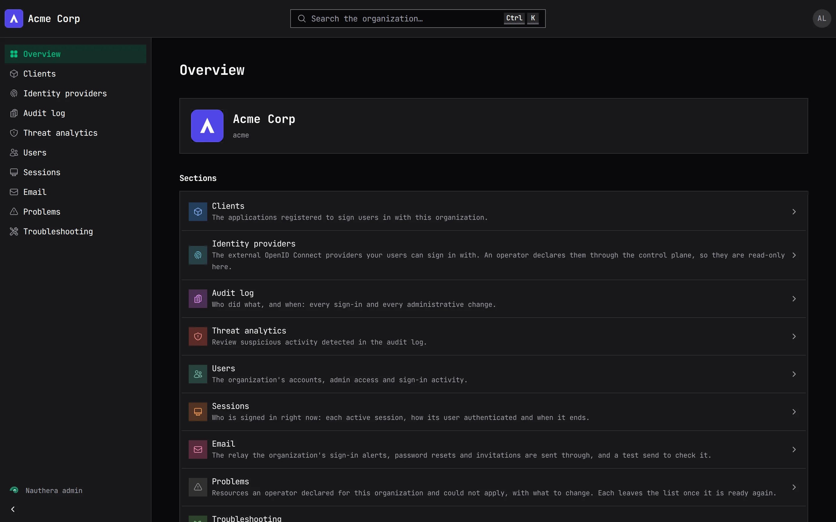
Where the pictures on this page come from
The screenshots on this site are taken from nauthera-server's own Storybooks, which
render each screen with the same components, theme builder and example brandings
(web/) that production uses. They are captured again
whenever the product's UI changes, so they show the current product.